
 RSS
RSS Email
Email "
"That led me to attempt my first ever creation of a 3-column blog, Jacq's Blogger Tips which debuted on October 1, 2009 using the Minibox v1.2 Left Justified (Wide). It's a free XML blogger template which is a 3-column clone version of the Minima template for Blogger, and basically for newer blogspot blogs. Though, it can be used for existing blogs, I understand that you have to painstakingly add all your widgets/gadgets again, as it is a third-party template. A big thank you to James William at 2600 Degrees who designed and graciously shared it with the world.
And, yesterday I chanced upon an awesome discovery at Three Column Blogger when I googled on how to know/find a blog's column width. Just have to share it here as I'm sure there are many bloggers who are as keen as me to convert or change a 2-column blog into a 3-column blog. Their tutorials with illustrations on how to create one are so amazingly simple and easy, you don't need to know about HTML at all to follow the step-by-step instructions. Moreover, you just need to modify or edit your existing Blogger template, and need not download a third party blog template which may expose you to undesirable elements. It is merely adding a new sidebar or third column to your existing 2 columns. Editing your existing Blogger template is definitely a better alternative where all your existing widgets will remain intact, especially for seasoned blogs that contained many.
Yippee! That was what I did straightaway after that wonderful discovery - tried at my test blog which has a Minima blogger template, by following the site's tutorial at Three Column Minima (Layout Version) that simply went like a breeze.
Thence, confidently converted my peacockflower.blogspot.com that has the Stretch Denim Light template with 2 columns into that with 3 columns. This was a little tricky as I first took the opportunity to change the existing template which has a fluid width template (in percentages) to the Denim template that has fixed width (in pixels). Though both are 2-column template, I now find the fixed width preferable as the placement of images or text remained as were when composed, whereas in a stretchable one some sections of large-sized pictures could be 'sliced' and text shifted when the browser window is reduced in size.
Here's sharing
steps taken to create a 3-column blog :
{ignore (A) and proceed straight to (B) if your template is 'Denim'}
(A) To change to a new template, from 'Stretch Denim Light' to 'Denim', following my preference as mentioned above :
- Go to Dashboard | Layout | Fonts and Colors. Bearing in mind that changing your template will discard any changes you've made in Fonts & Colors, you'll need to jot down on a notepad, the color hex code and fonts of all the elements in your current template so that they can be easily replicated in the new template. Page elements, on the other hand, will be retained when changing to a new Blogger template, so nothing to worry here.

- In the same Layout window, click the Pick New Template tab and scroll down to select Denim. Then, click Save Template.
- Return to Layout | Fonts and Colors, and make changes to the elements, basing on what you've copied on your notepad or probably 'paint afresh' as you so desire your blog to be. Let Blogger help guide you, if necessary.
- Your blog should now look brand new with the 'Denim' fixed width template and is now ready to be transformed from a 2-column blog into one with 3 columns as steps shown below.

- Go to Dashboard | Layout | Edit HTML. Before editing your template, save a copy of it by clicking the Download Full Template tab as a precautionary step in case you mess up your template.
- Scroll down or CTRL F to find the code #header { and change the width from 760 to 940 px.

- Similarly, do the same for the following codes - scroll down or CTRL F to find the code and make changes :
a) #content-wrapper { - change the width from 760 to 940
b) #main-wrapper { - change the width from 464 to 510 and margin from 14 to 15
c) #sidebar-wrapper { - change the width from 240 to 185 and margin from 14 to 15


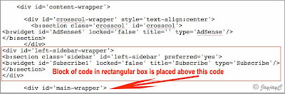
- Now, you have to be very careful to copy (CTRL C) the whole block of code in red below and paste (CTRL V) it exactly above the #main-wrapper { code. This will add a new sidebar or column on the left side :
#left-sidebar-wrapper {
margin-$startSide: 15px;
width: 185px;
float: $startSide;
background-color: $mainBgColor;
display: inline; /* fix for doubling margin in IE */
word-wrap: break-word; /* fix for long text breaking sidebar float in IE */
overflow: hidden; /* fix for long non-text content breaking IE sidebar float */
}

- Finally, scroll down or use CTRL F to find the <div id='main-wrapper'> code. Then, directly above it, paste (CTRL V) the following code in red :
<div id='left-sidebar-wrapper'>
<b:section class='sidebar' id='left-sidebar' preferred='yes'
> <b:widget id='Subscribe1' locked='false' title='Subscribe' type='Subscribe'/>
</b:section>
</div>
This is just to insert the RSS feed widget into your new sidebar temporarily, which can be removed and replaced by your other desired widgets later at Layouts | Page Elements, after you've completed adding the third column.
- Next, click Preview to see whether all's well with the addition of the new sidebar and margin width between columns are as desired. Then click Save Template and View Blog. Otherwise, click Clear Edits and try again.
That's all there is to it, you now have a fabulous blog with three columns! Congratulations! Quite simple and easy, right?


- Changing the width of the columns is easy as exampled above, but you must remember that the total sum of the columns' width plus all the four margins must not exceed the width of the main page. In my example, it is 940 pixels which is made up of the main column (510 px), two sidebars (2x185 px) and four margins (4x15 px), altogether totaled exactly 940 pixels. Know further about adjusting width of columns and margins here.
- Sometimes, you may need to make some adjustments, due to the switch-over from 2 to 3 columns. In my case, I had to redo my header image that went out of alignment due to the expanded page width. Also, a couple of Google ads went missing or disappeared. This was easily rectified by deleting any excess ads, since I was fully aware that Google Adsense allows only 3 ad units and 3 link units per page.
- You can easily change your new left sidebar or column to the right if you wish by changing its float setting. Refer to step (B)4. above and change the code from $startSide (which refers to left) to $endSide (which refers to right). These html codes are case sensitive, so be extra careful in typing as they appear.
Ta..da!! Here's how my 3-column peacockflower.blogspot.com looks now, displaying the main column with a sidebar on either side! It's as I had desired for a very long time. Woohoo, I'm so blissfully happy!

The next image is just an illustration on how it will look like with both the sidebars to the right of the main column. And, how easily it can be done by just changing the float setting as mentioned above under the sub-item, Points to take note. Hmm...having discovered this, I'm at odds with my earlier preference...haha!

So delighted that I've learned much by just taking the challenge to transform my blog. Haha...not only do I now posses an online 'dream home with 3 panels', but I'm able to continue 'renovating' it with the additional knowledge acquired on the template's HTML codes. I had earlier seek to just know how to locate the width of a blog's header and columns, instead I got much more into the bargain! How wonderful!
Credit goes to Three Column Blogger: 3 column Denim for the well-presented tutorial, without which, I'll be hopelessly deprived! A big thank you for your generous sharing.
Do hop over to that awesome site to check whether they have a 3-column tutorial for your Blogger template design. Included so far are for Denim (1), Minima (4) and Rounders (4). Don't despair if your blog's template is neither one of them. What you can do is, firstly, change anew your blog's 2-column template to one amongst the 9 available template (Denim, Minima or Rounders) that appeals most to you, like I did at step (A) above, and then return to Three Colum Blogger's site to find the relevant tutorial to guide you through in creating your dream 3-column blog.
All the best and happy blogging!
Update: 20091211
Haha...equipped now with more in-depth knowledge on HTML template, I became a little adventurous today and gave a brand new look to this blog. Though it was a 3-column layout with the Minibox template, I didn't quite like the defining verticle lines separating the columns. Besides, I wanted both sidebars to be to the right of the main column. Knowing that it can be simply done by myself now, I had it first converted back into a 2-column Minima template by Blogger, before changing it into a 3-column layout, using the tutorial for Three Column Minima (layout version) as a guide.
The picture below shows the 3-column layout of both templates, Minibox on the left, that is now replaced by Minima on the right.

Yippee, so deliriously happy with its result. A big applause and thank you to Three Column Blogger. :-D


Hi Jacqueline
ReplyDeleteThanks so much for helping me out and revamping my blog into 3 columns. Love the new look! Thanks once again.
You're most welcome, my dear friend. The joy of helping is immeasurable!:-D
ReplyDeleteAnd, I'm so delighted you love your brand new 'home', it does look great, huh!
Hey Jacqueline! So I decided to take your advice to make my blog three columns but for some reason my left side is perfect but my right side does not start showing content until the bottom of my site. What do I do to fix it?
ReplyDeleteHi Elizabeth! Observed from your blog that you've solved your problem by choosing the Blogger Template Designer which offers the 3-column layout. Congrats... great makeover at your blog!
DeleteI really enjoy simply reading all of your weblogs. Simply wanted to inform you that you have people like me who appreciate your work. Definitely a great post.
ReplyDeletewebsite design
Thank you and have a lovely day!
Delete